Krieder is a luxury Kitchen and furniture brand, specialising in bespoke interior design. Supplying premium German kitchens to retail and commercial sectors. With the aid of JW Design, Krieder looks to embark into the world of e-commerce furniture supplier as well as maintaining their usual interior design + installation service.
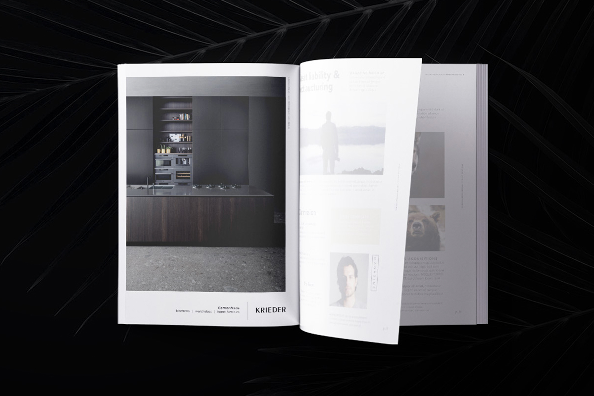
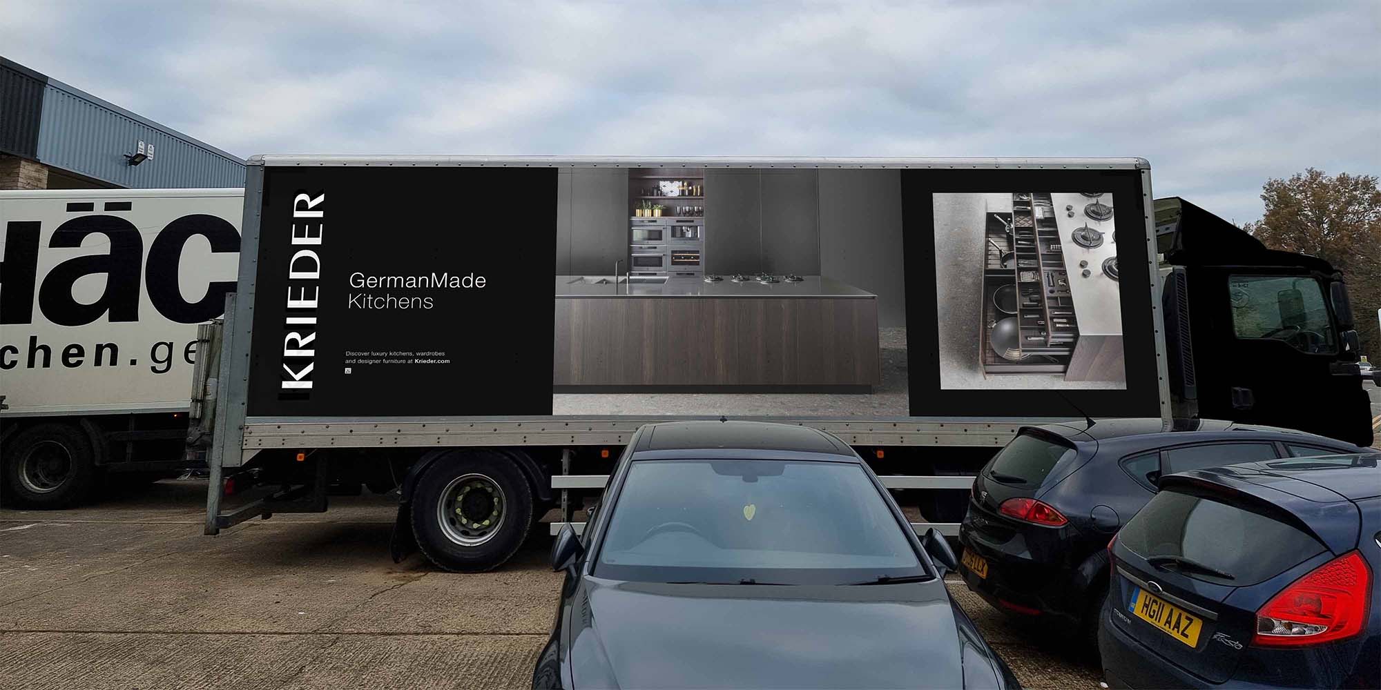
Luxury, refinement and aspiration - from all areas. Ensuring a consistent design style across multiple marketing channels and corporate vehicle liveries. The Krieder brand ran multiple print ad publications, seen in local magazines to commercial sector publications - the brand needed to be consistent and on-trend to entice new business and new clientele. Commercial vehicles were given updates where possible, taking the brand to a new level. JW advised and executed the overhaul of the artic sized delivery lorry graphics, visualising the brand and transforming from a plain white van with no brand relevance.


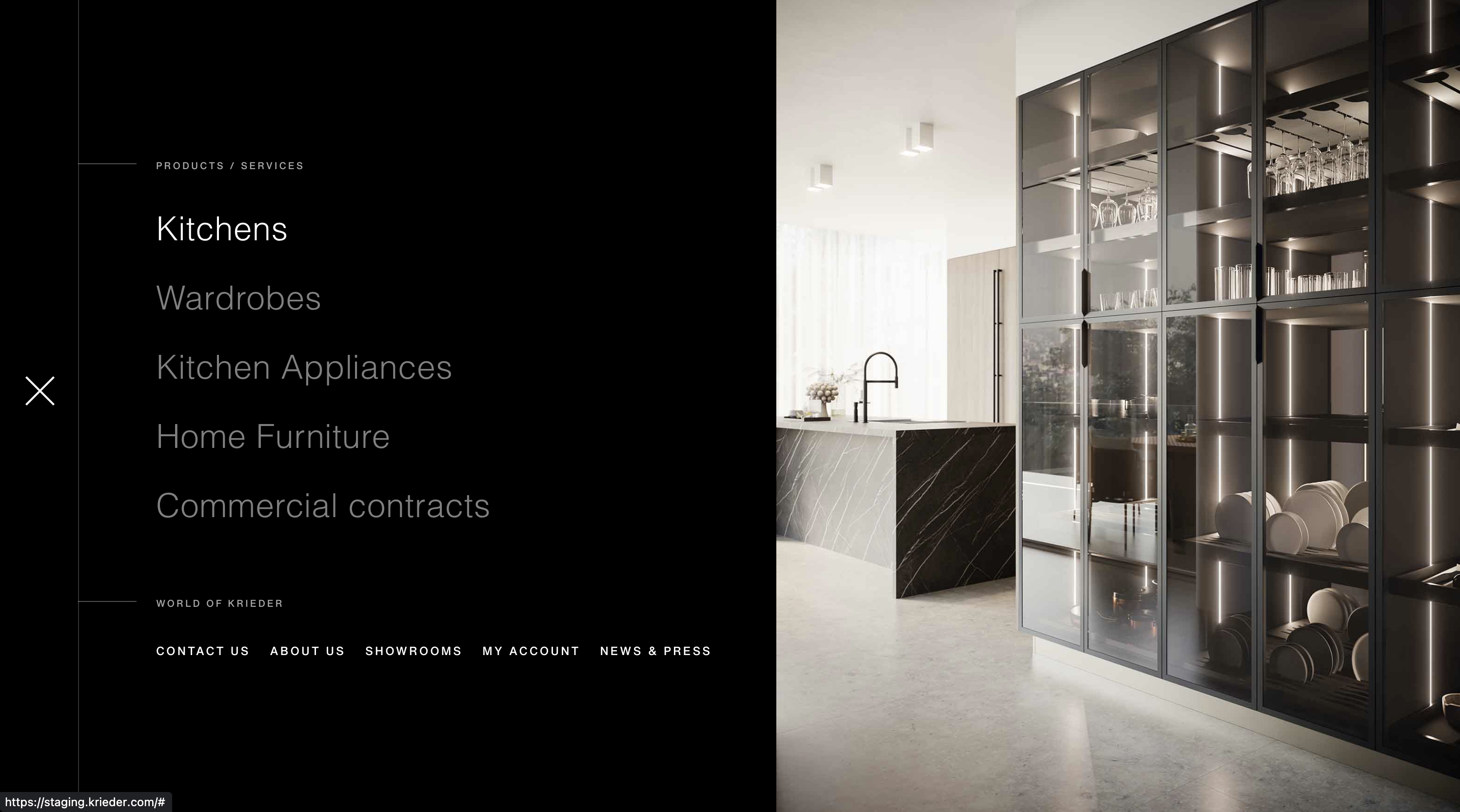
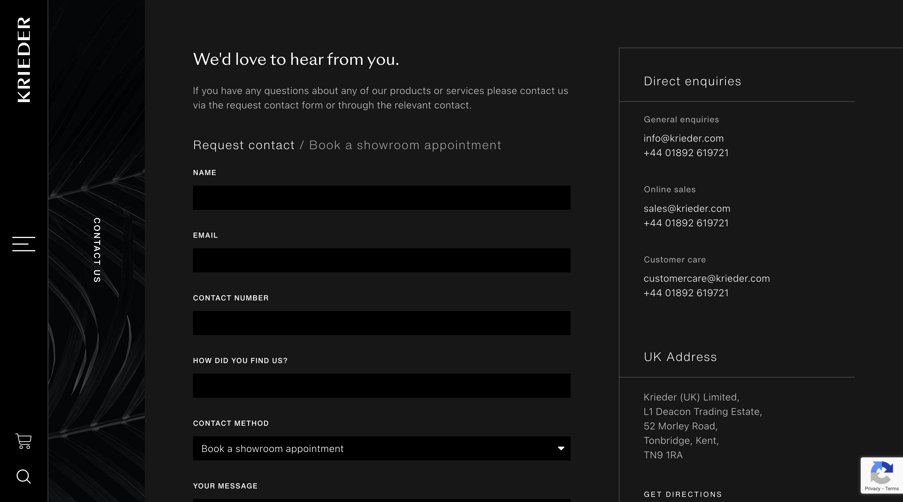
The aim was to keep in-keeping with the sharp, dark elegance of the German kitchen brand whilst pushing functionality to impress digital conscious customers - as well as keep their existing client base returning. Staying religiously to the brand colours, emphasis and layering was created strictly with the opacity of elements, even making it a key design feature with headings - emphasising particular words and phrases. The design is sharp and angular, with imagery connecting without spacing to reflect the kitchens and interiors they design, nothing rounded or quirky here. The website needed to immerse the senses with use of rich image and video content, which was further optimised by setting up a additional widescreen breakpoint. The website uses slight variations of the product page for each different type of product in the e-commerce store. Most of the products require a more bespoke approach to handling orders, as they usually require some customisation to cater to the customers individual preference - so the products require a contact request to begin the sales journey. The colour page is used as a clear differentiation between the normal website (inspiration based) and the online store. The whole website uses very minimal linear styling, giving an architectural aura - the perfect solution for a modern, interior brand.


