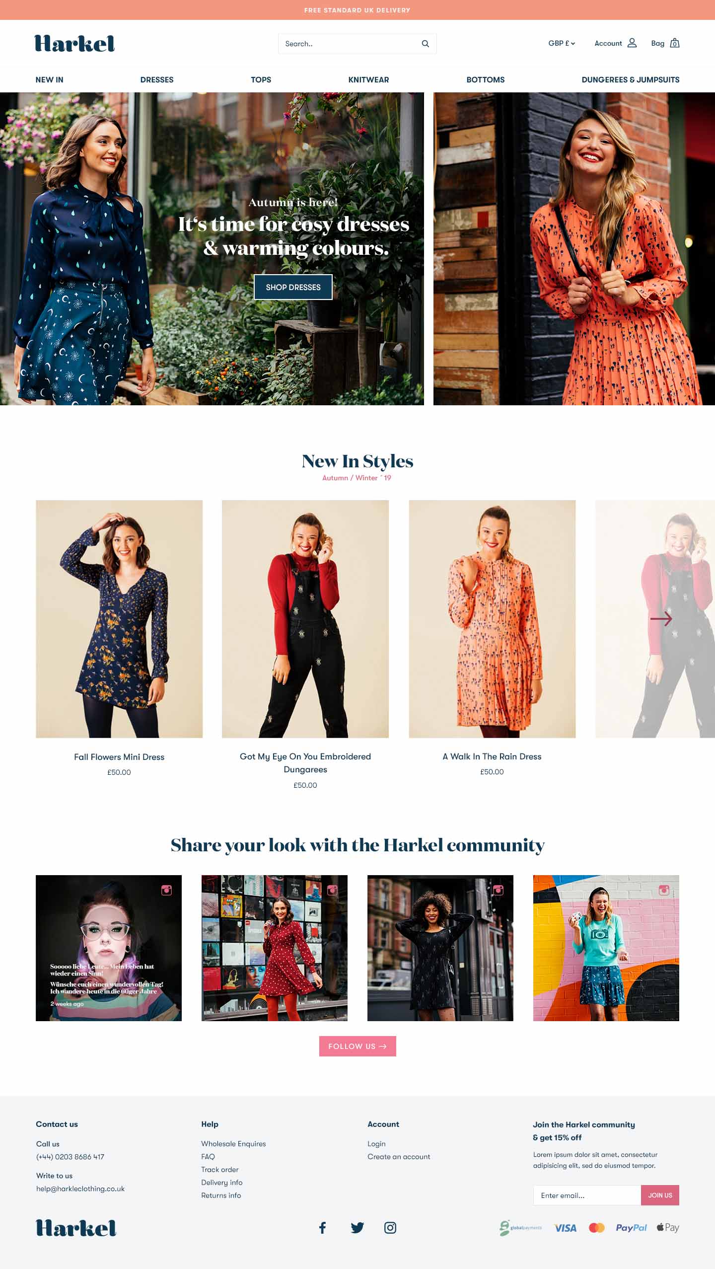
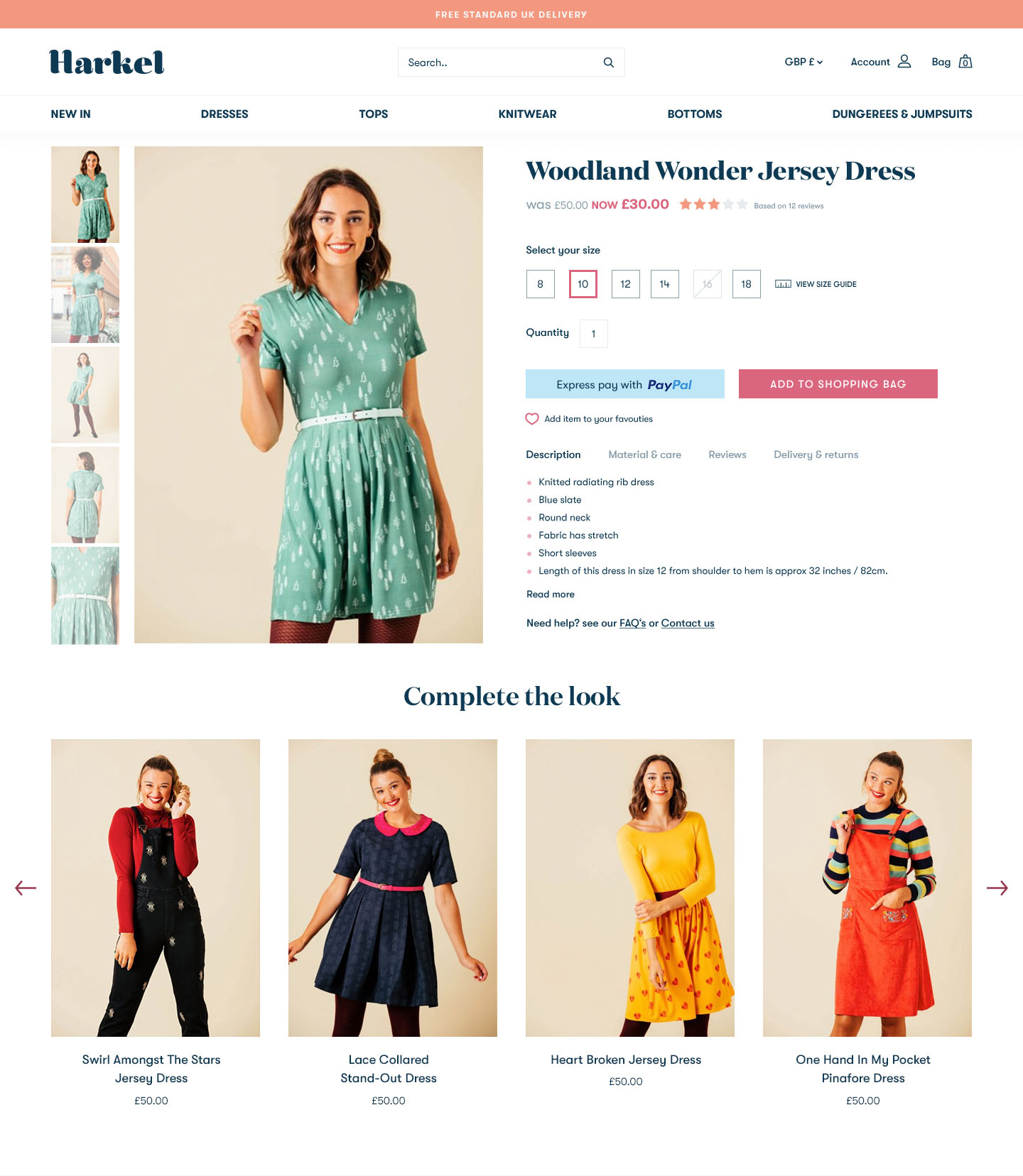
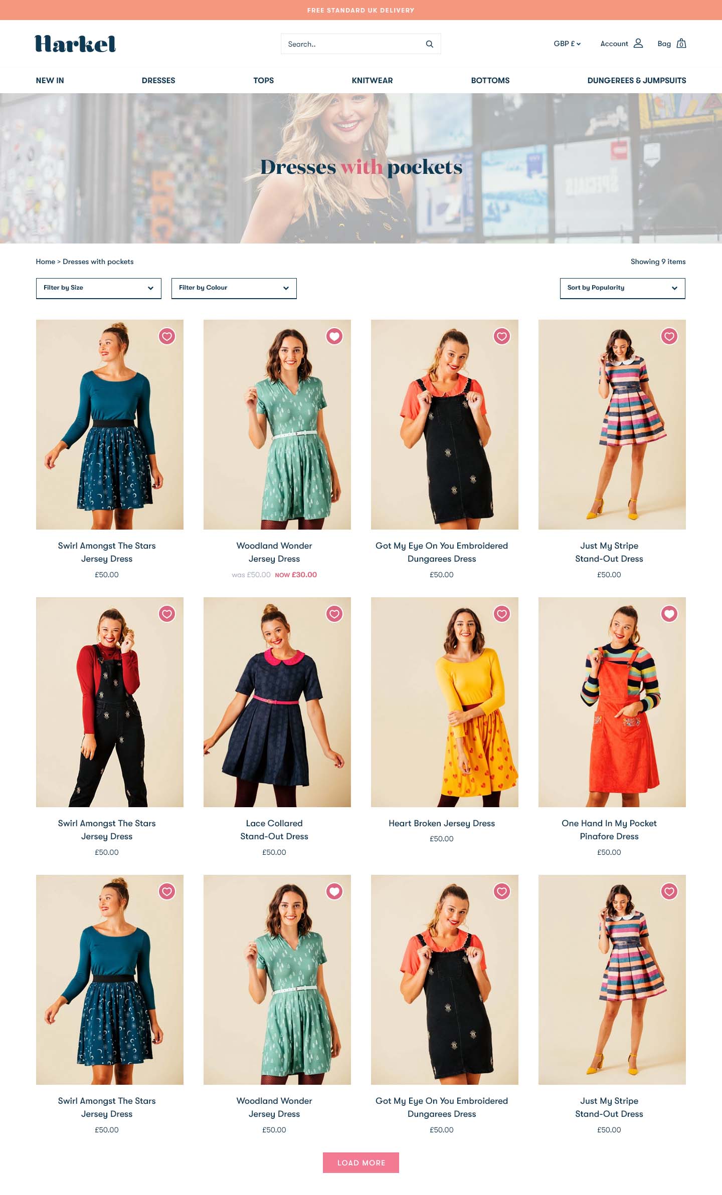
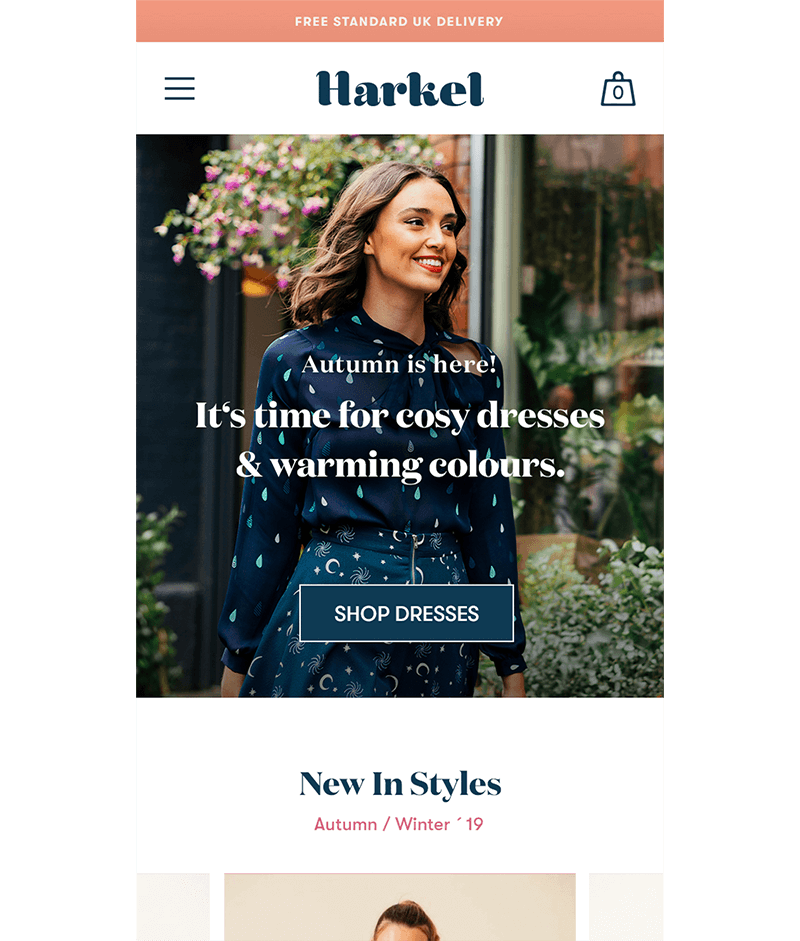
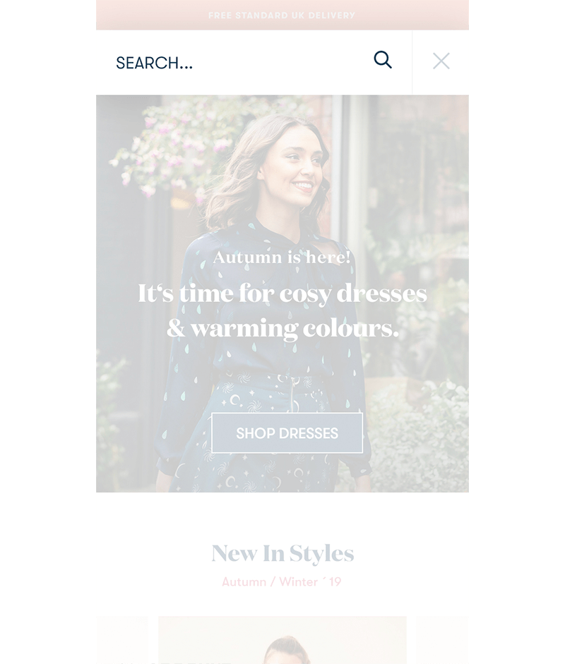
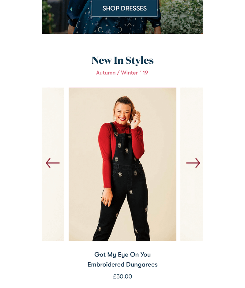
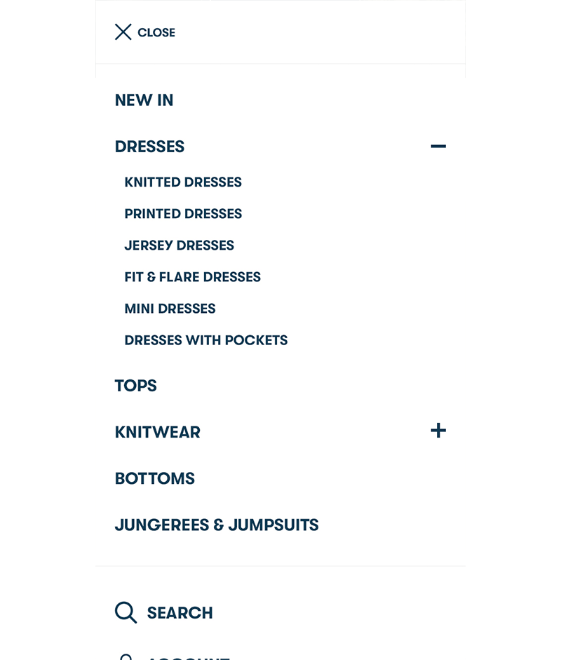
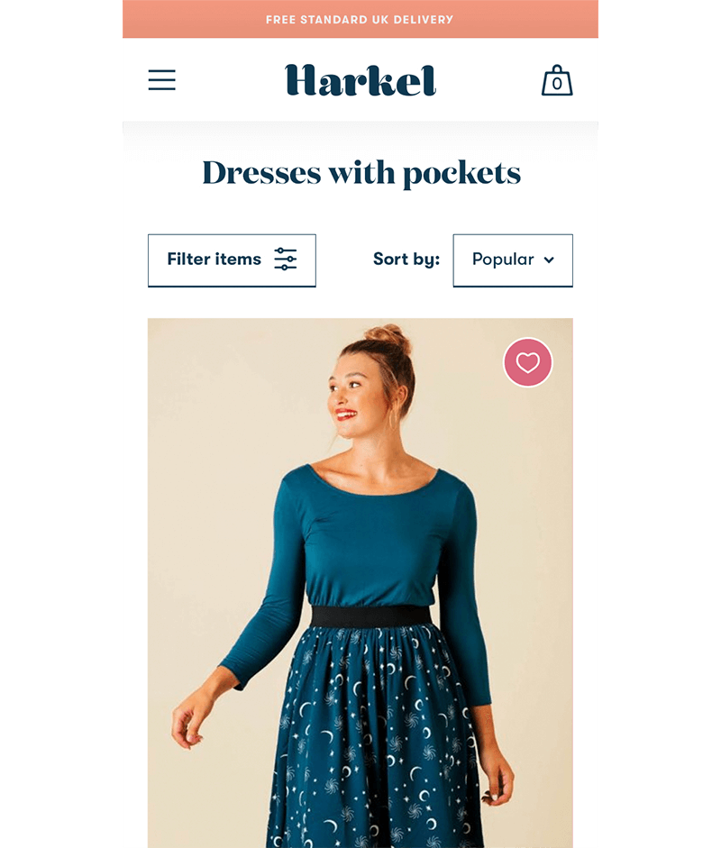
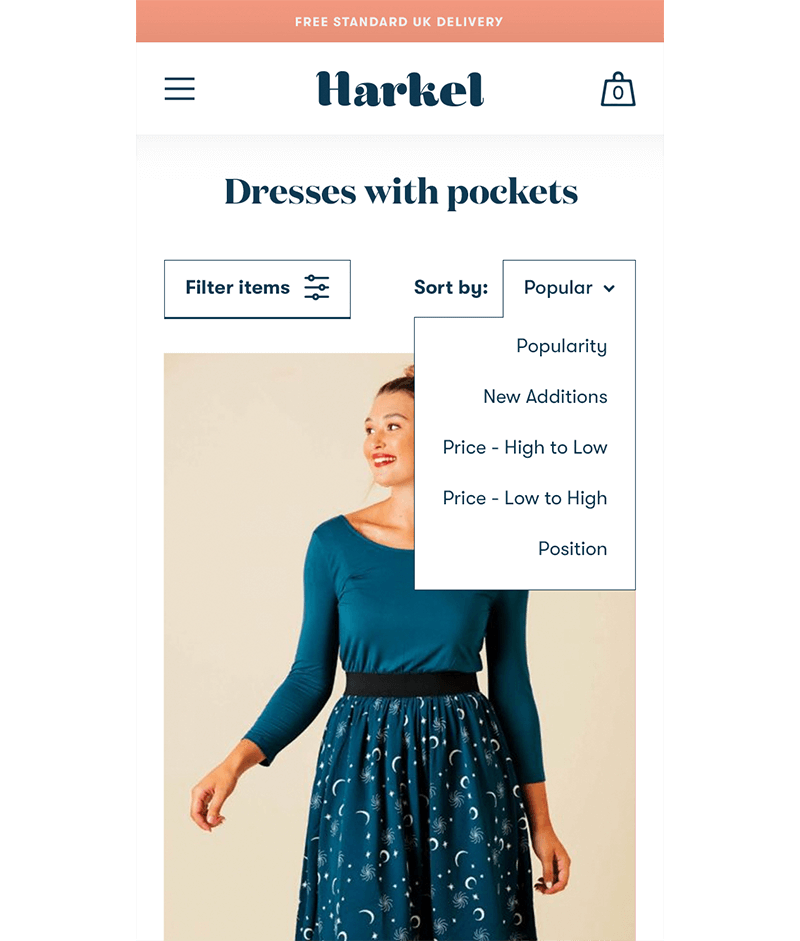
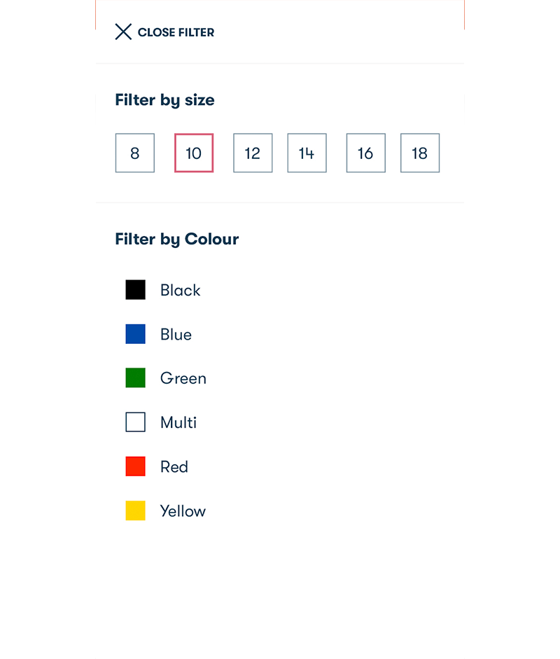
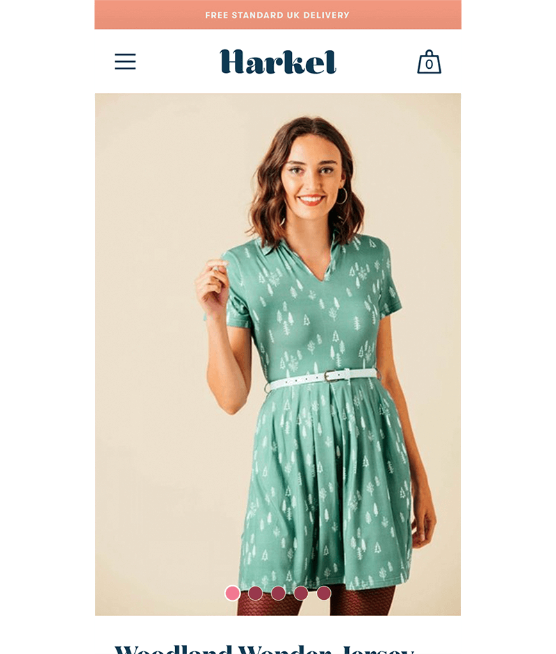
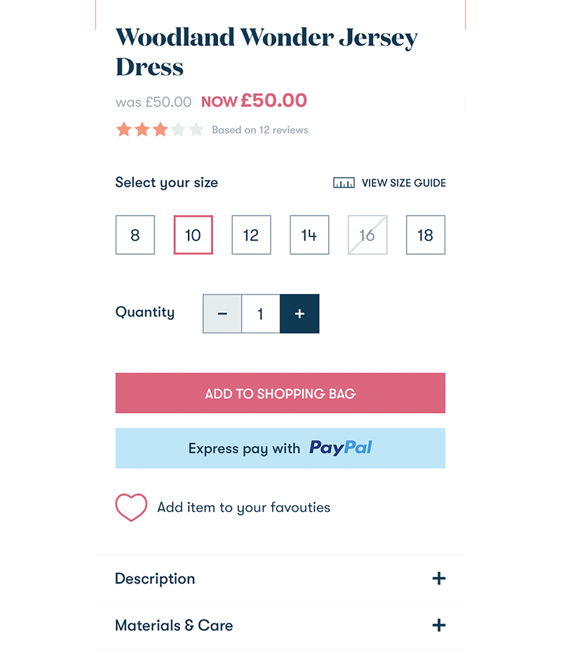
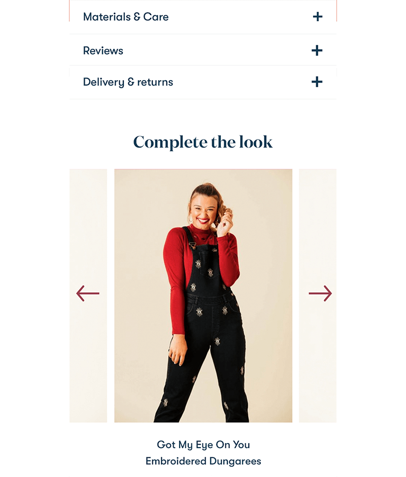
Alternate fashion brand Harkel clothing wanted to refresh their website in time for their Autumn / Winter collection release. The Brighton based brand prided themselves with their quirky apparel and charm, adopting various colours from the rainbow in their branding to signify their inclusivity ethos. The task was to redesign and give their website a more universal appeal. A tight deadline needed to be adhered to in order to win the work, the full website redesign was completed in a week!
The previous website used many colours broadly, we thought rather too broadly with continuous clashing of bright colours and varying call to action button colours - causing further confusion to users. Of the 5 brands, we narrowed them down to just three (removing purple and mustard), using the brightest for key CTA's. The new website provided a clear pathway for the user with bright colours and let the colourful imagery shine, not fighting for attention with other elements on the page.
