Appnova

Appnova

Establishing a new level of desirability for London-based creative agency AppnovaEstablishing a new level of desirability for London-based creative agency Appnova
the Mission

Project Overview

JW was tasked to visualise 2 distinct UI directions for Appnova Creative Agency’s flagship website in the form of 2 design sprints. Armed with pre-set brand assets, JW conceptualised new desirable directions for the agency to level up the agencies luxury consumer appeal.

Services

Website UX/UI / Interaction Design

Website

UX/UI Concept 1

Inverting the current brand with an all-new premium dark UI complimenting a re-structured UX project navigation.

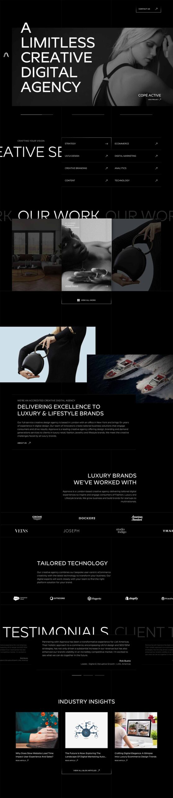
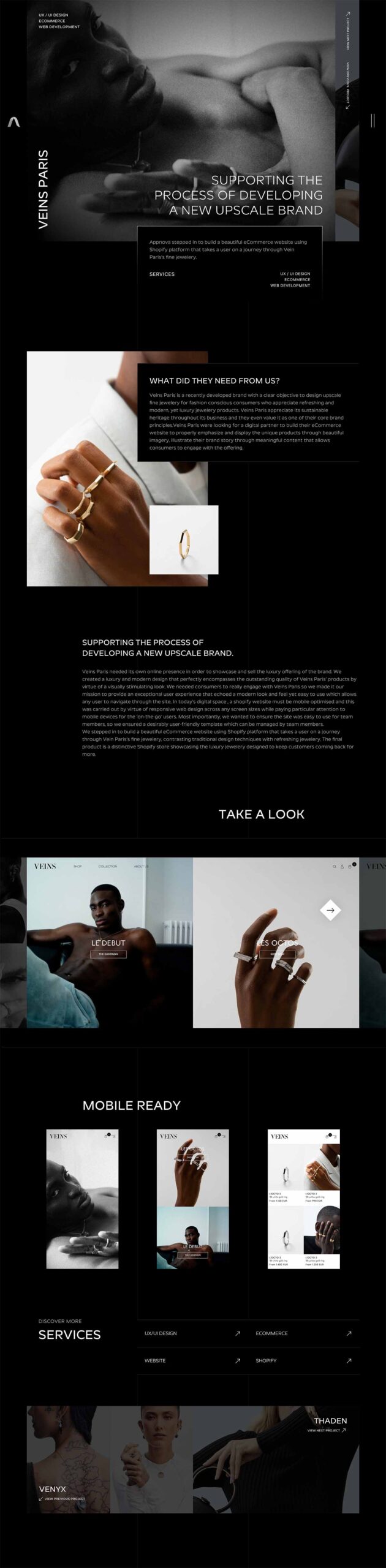
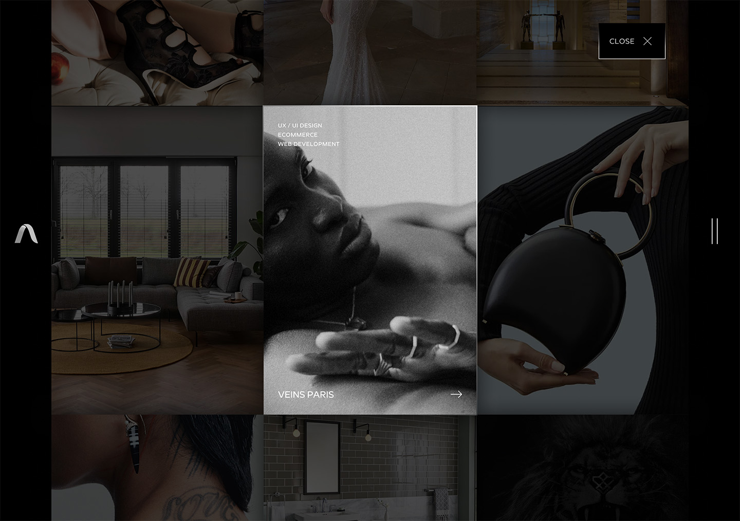
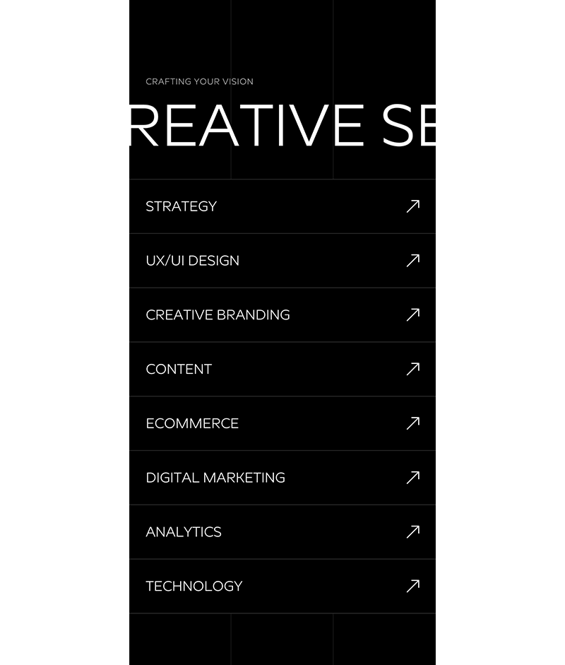
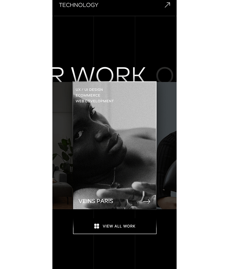
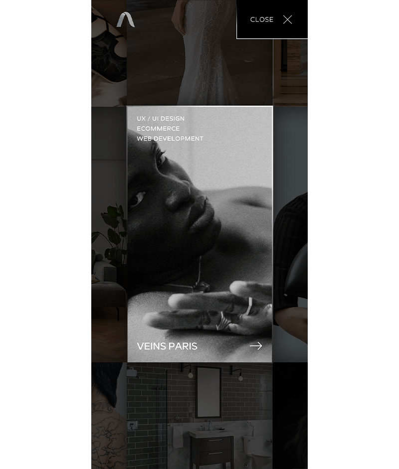
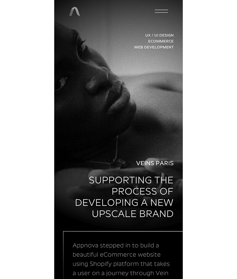
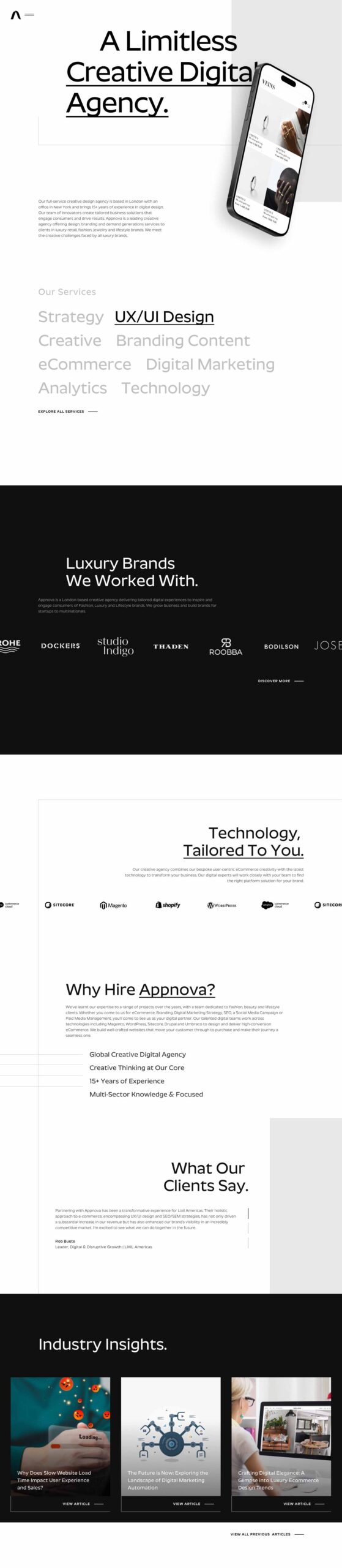
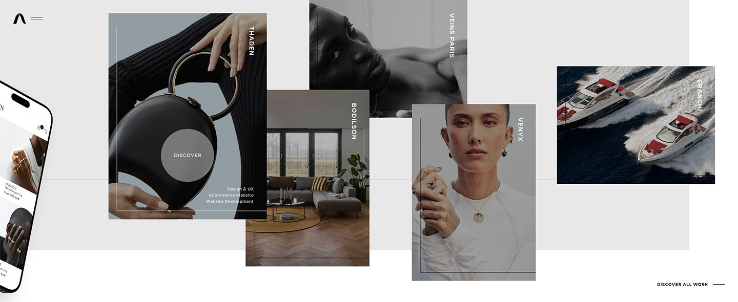
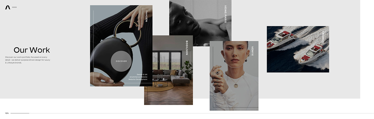
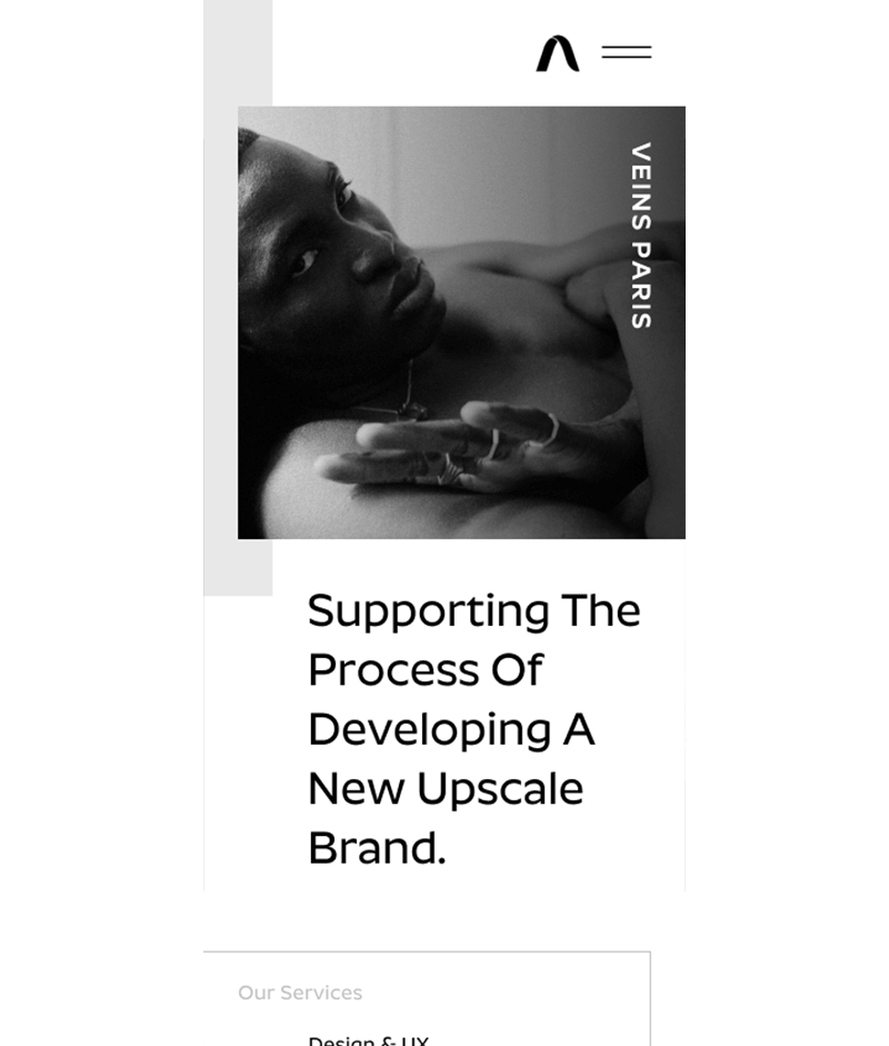
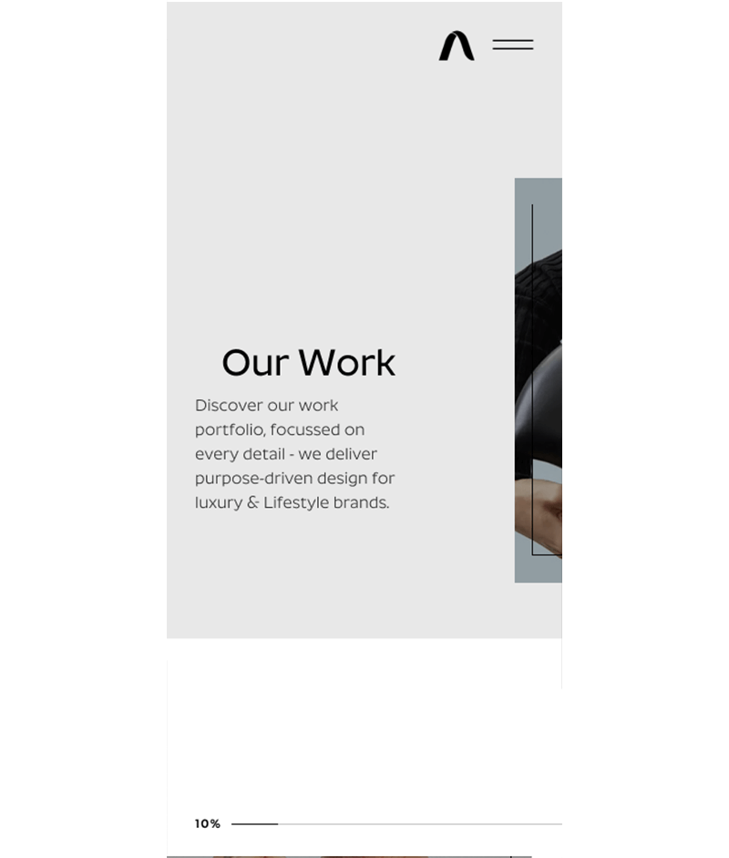
Redirecting and inverting the current visual style to an all-dark UI, this concept focussed on establishing a premium aesthetic inspired by the fashion brands they wish to target for eCommerce development. The content is hung on 3 underlying structural lines which are visible and assist in distributing the content down the page in a modular manner. With a blend of high-fashion aesthetic and modern UI components - the site gives the user confidence in the technology capabilities whilst portraying the high-end feel they wish to target. Taking inspiration from previous company branding, the ident (A) was given a metallic treatment to contrast the minimalistic design, combined with gradient hover interaction buttons. Optimising the beautiful lifestyle imagery and engaging with a luxurious use of vignettes. The UI uses opacity to guide the user to action, highlighting rich-content to explore further. The project listing grid uses a central focal-tile to aid navigation using the keyboard arrows and using scroll-snap on both desktop and mobile devices.

UX/UI Concept 2

Minimalism & aspirational, an on-brand showcase of their creative digital offering.

Staying true to the existing brand aesthetic and visual style, concept 2 injects both minimalism & expression in the design direction. Accentuating sharp corners and linear elements highlight content and the guide user experience, whilst providing scope for interaction/animation. The main hero utilises pinned (horizontal) scroll to showcase featured project listings before continuing down the page to the provided services. User-actioned scroll triggers the rotation of the mobile device then the page proceeds horizontally to show the featured tiles. JW further conceptualised the project listing page with the same navigation (horizontal) complete with progress bar due to the amount of projects to be shown (50 listings), this provided the optimal solution to showcase the earlier and archive historic projects at the back of the page. Subtle hover interactions are applied to the project listing tiles, revealing additional content and a change of colour in the decorative line from black to white to engage the user to explore. The grey box was found in the design language in internal presentation decks and re-formatted into the page designs. The site features an asymmetrical balance with agency inspired enlarged typography.